Public home
The redesign process of the public home page of Akazoo music in the web.
Overview
A new version of the Akazoo public home page was decided to accompany the updated and enhanced profile of the music streaming service: more diversity, bigger music catalog, updated features, AI music suggestions, and more.
The process of redesign had many steps of development, trial and error, and revisions but also it was the ideal project to promote my creativity skills using allegorical assets.
Responsibilities
UI design
Successfully delivered
Web
Mobile web
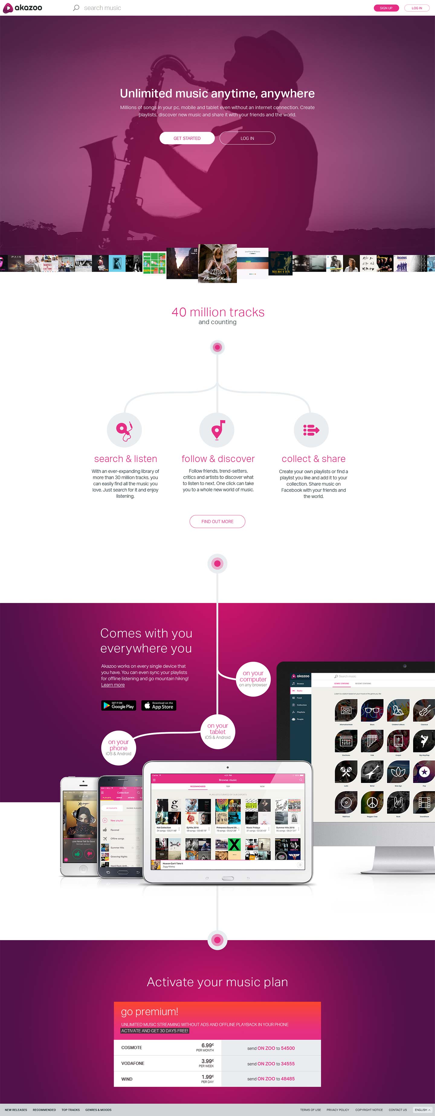
The past
The initial public home page was designed in 2016 along with the version 2.0 of the service - a big revision and revamp. It was clear that the design was outdated and it didn't reflect the current profile of music streaming.
The update was necessary and the product team set the specifications: strong branding elements, express the (music or other) diversity of the users, and keep marketing messaging as minimal as possible with high impact.
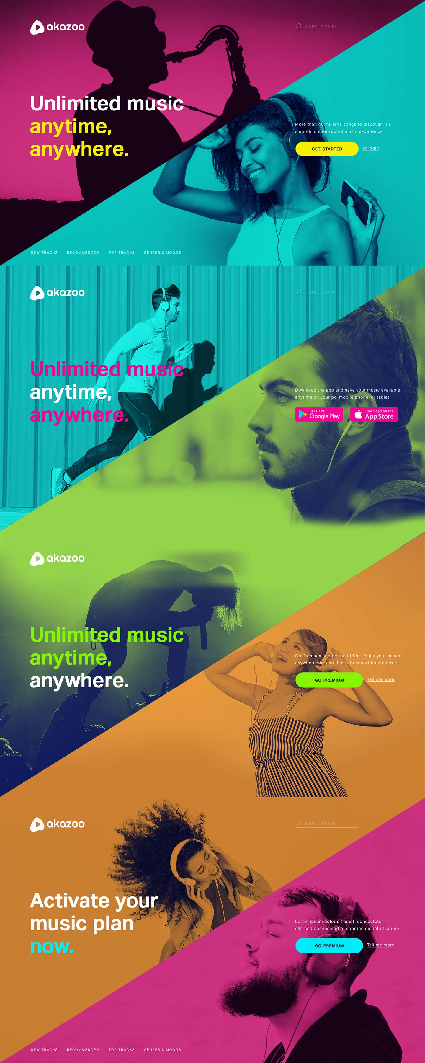
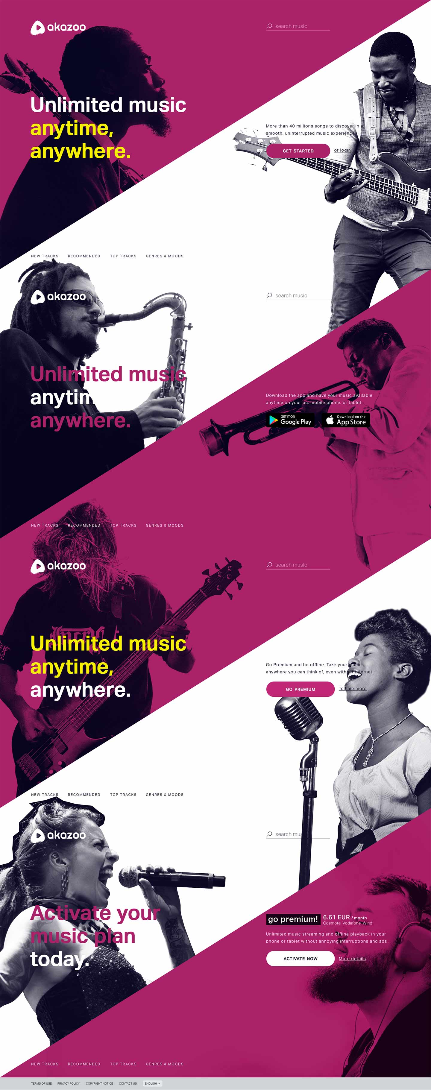
1st draft
The first attempt was to express the diversity of music and users using vivid colors, splitting the home page in 4 sections based on the CTAs that users want to find and the ones we want to promote: Join the service, Download the app, Upgrade subscription, and Pick a subscription plan that suits user's needs.
Having in mind SEO, I kept in fixed position the main content browsing sections and search so that the music catalog can be available to public users and the bots.
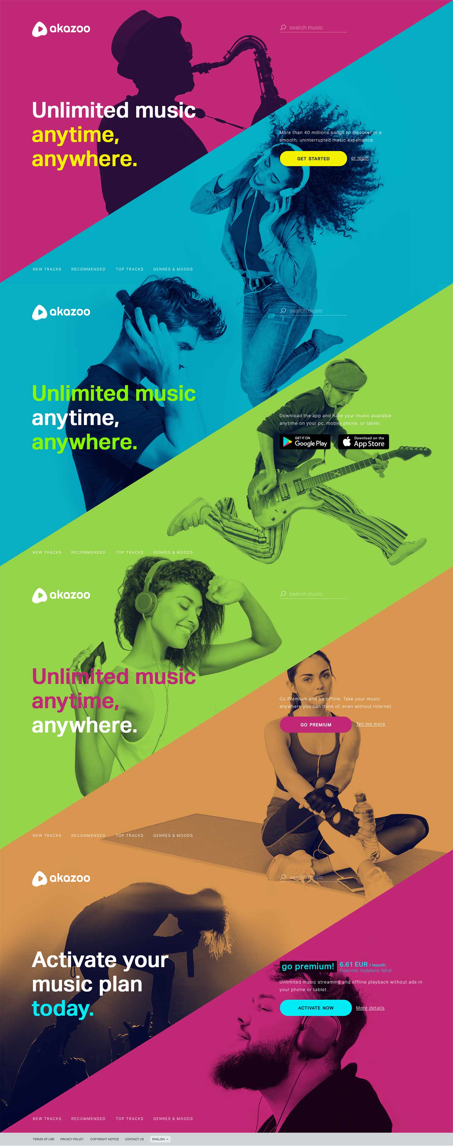
2nd draft
Although the first draft was promising, the use of lifestyle imagery was not ideal because most images were cropped and the UI continuity was not obvious. So, a second draft was proposed with better and more expressive imagery that could fit in the sections defined before.
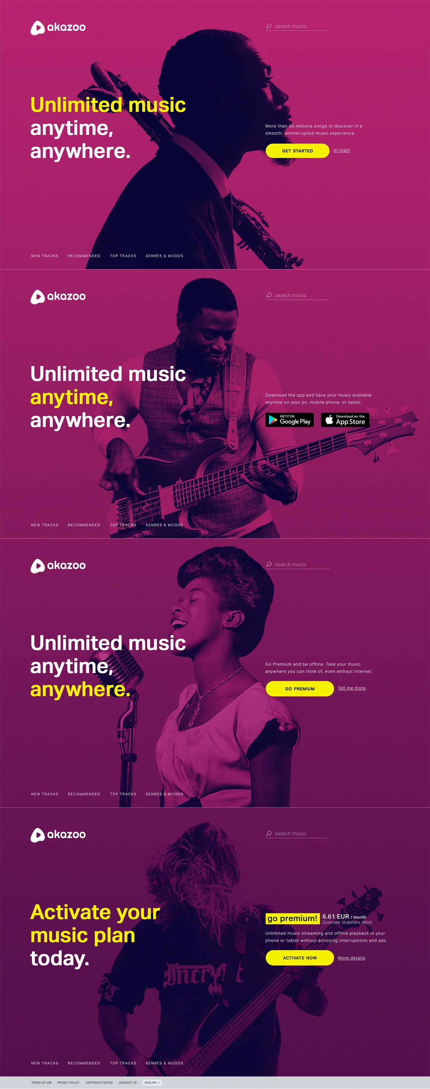
Variations
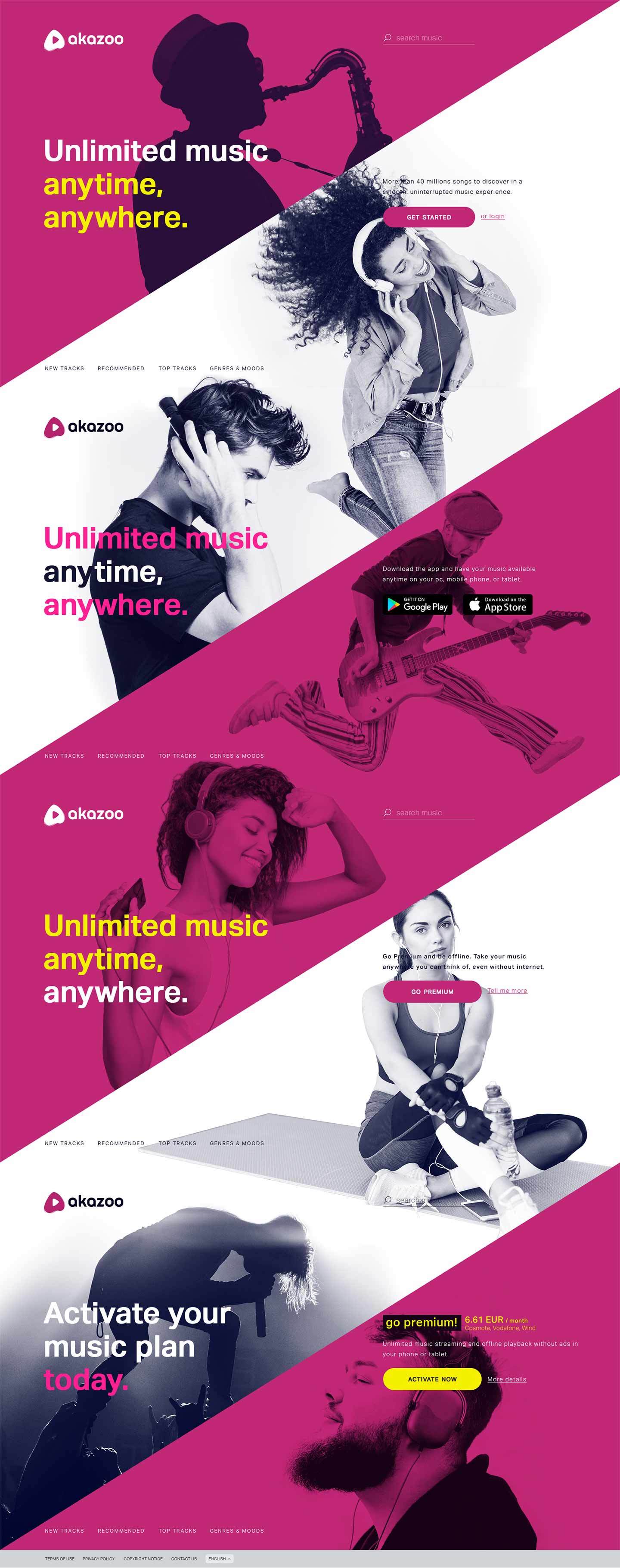
After feeling that user diversity can be identified only with the use of lifestyle images, I along with the product team proposed that we could emphasize more on brand colors. So, I removed the vivid colors and used only the brand colors keeping the same imagery.
Variations
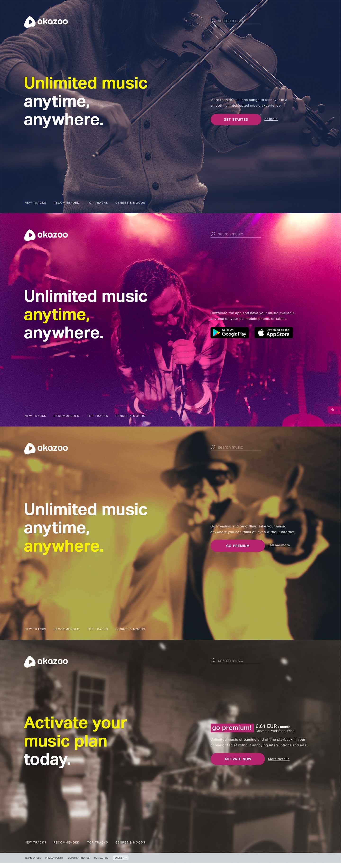
At this stage, we wanted to explore alternatives like expressing music variety and genres with representative musicians in the same layout.
New draft
Following the approach above I needed to simplify the section layout displayed each time on screen and keep consistency between background and text colors. The diagonal section split was removed and added an overlayed image on top of the gradient background - gradient background reflects UI continuity and image on top defines each section.
The overlayed image can be loaded in any section despite the contrast of the background. Additional music genre-related images could be loaded each time the page reloads - sort of dynamic look.
Variations
The same layout and logic was used with fullscreen images representing music genres to emphasize on music atmosphere rather than music symbols.
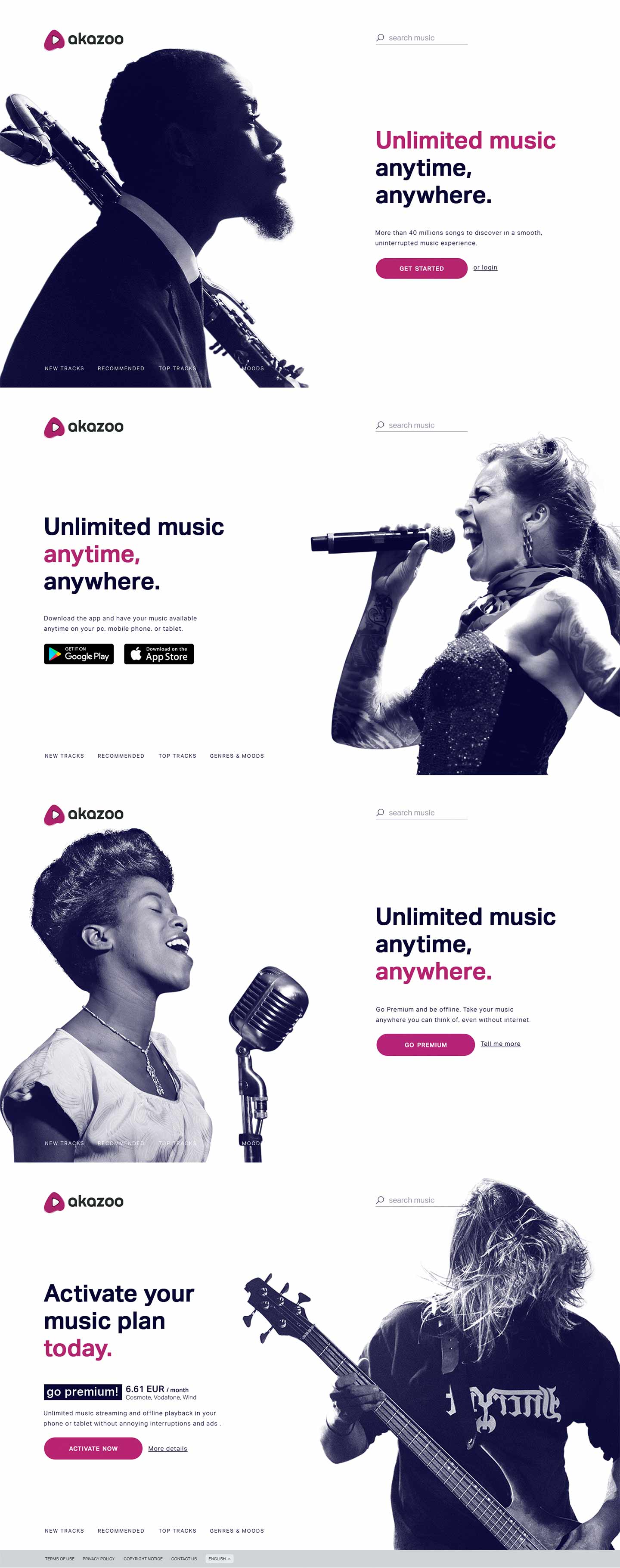
Simplify!
Based on the proposals above, I felt that brand colors were too dark or even tedious as background. Fullscreen images have strong impact but they lack legibility.
The page had to be cleaner with high-contrast feel. So, another draft was designed with discreet brand colors and changes to the layout so that text and images have specific placement and better legibility.
Final proposal
After countless revisions and analysis I have identified exactly what are the assets I need to keep and the layout that would accommodate our needs.
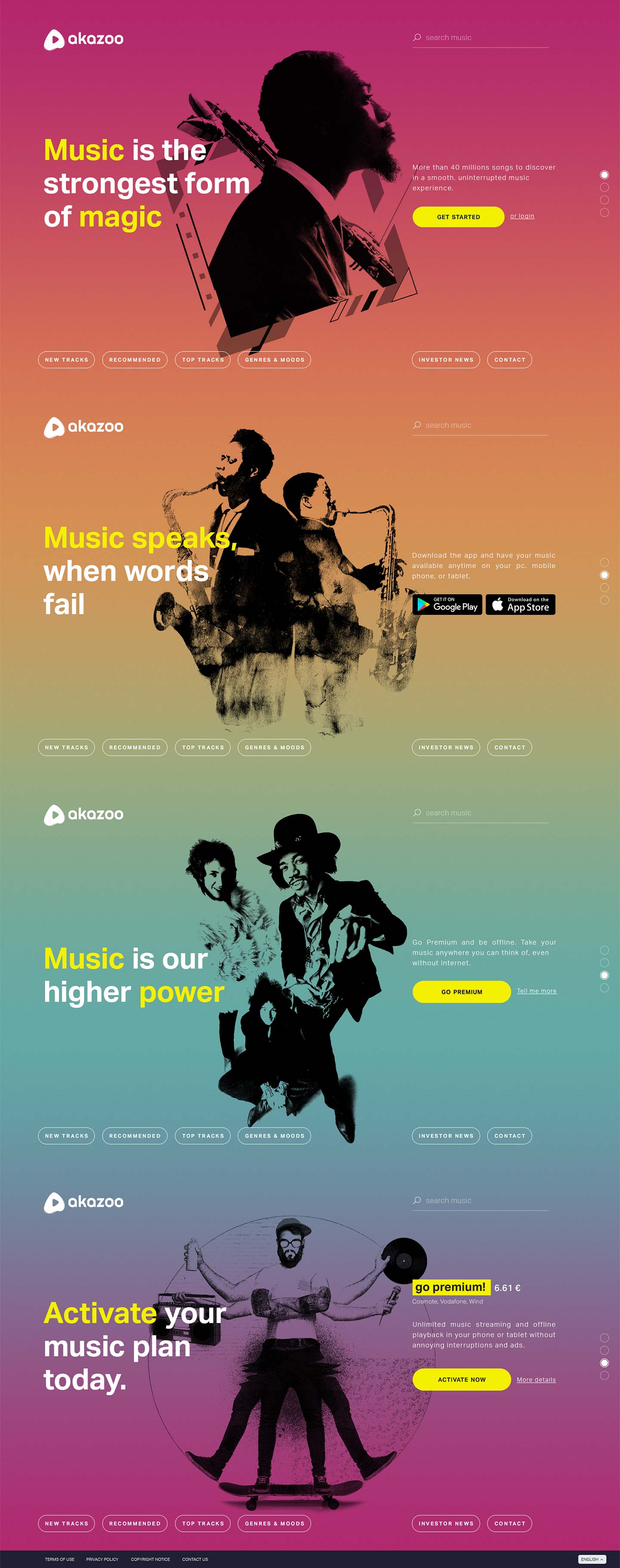
I chose to use a vivid gradient background for the whole page. The multi-colored background represents music and user diversity. However, it also represents Akazoo's different services and products - Magenta is the primary brand color, Orange is the brand's complementary color, Aquamarine is Akazoo's Radio app primary color, Purple-to-Magenta gradient is the Akazoo's Inflight app colors. The gradient background also reflects the UI continuity between sections that is essential in order to make users explore all home page sections.
The images used are all music-related and modified in such a way that can be loaded in all sections randomly to always give a fresh, new and clean look. Since those vivid colors are not distracting, legibility was guaranteed and longer versions of texts could be accommodated if needed (e.g. when localizing text to other languages).
Bringing everything together my final proposal was as below and all teams involved in the process agreed to the production of this proposal!
Responsiveness
Having in mind that every public page has to be responsive, I have designed multiple variations in basic screen sizes to demonstrate the position and scaling of each element according to the width and height of the device used.