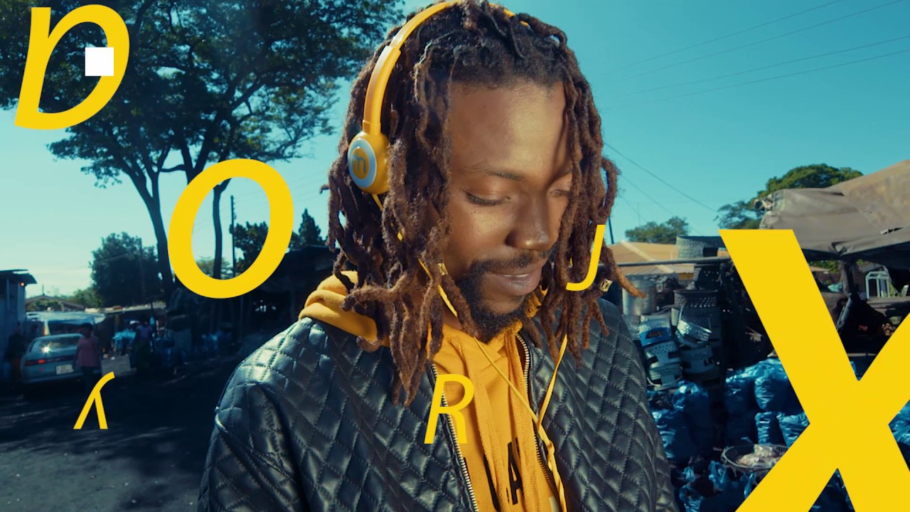
MTN Music+
Listen, discover and download music anywhere, anytime. Access millions of songs with the latest local and international releases, top exclusivities and recommendations.
Overview
A cross-platform premium music service for MTN customers to listen to millions of songs, artists, albums and playlists. Discover new tracks based on music likes or play history and get smart recommendations to match user's mood.
A music service that allows users to collect and organize their favorite tracks, albums, artists, and playlists. Create, edit and share playlists or sit-back-and-enjoy listening to endless music streaming.
Responsibilities
UX design
UI design
Successfully delivered
iOS app
Android app
iPad/Tablet
Web app
Mobile web

My role
I was the lead designer, responsible for providing UX solutions to fulfill business and user goals, translate ideas and propositions to high-end interfaces, and create the design system that helped developers and PMs expand the service with high consistency.
My daily tasks involved user analysis and deep research of the competition to identify design patterns and incorporate them in the most common features of the product. I collaborated with Product and Project managers to set and fullfil the specifications in business perspective and compromise them with user needs by creating the required flows, user journeys, wireframes and prototypes, discussing and analyzing them repeatedly and revising them as needed.
Plus, I was the link between design and development teams by providing detailed guidelines to developers to ensure that all designs were developed as intended and that the product was pixel-perfect across all platforms.

Listen to the users
User research provided very useful insights about the music streaming users. Three distinct user groups were identified: Collectors, Explorers and Passive users. However, an average user can belong more or less to each of these groups so, we were dealing with user behavior rather than strict demographics and the service was designed around these personas.
Collectors
Users that like to collect and organize their music. Adding tracks, albums, artists in their collection, organizing their music in playlists and thoroughly diggin out all possible music they are familiar with. In other words, gathering their music in one place.

A collector's typical journey starts with manual content discovery, adding items in the Collection and eventually in the player.

Search is the most powerful tool for collectors. Instead of loading long lists of categorized results (tab implementation), a more concised approach was preferred. It was observed that more than 80% of users found what they were searching for in the top 5 results of each content group (tracks, albums, artists, playlists). This observation was taken one step further and a single top result - best guess - was provided based on search frequency, item popularity, search history, and user music preferences, followed with the top results of each content category, in a single view.

Collectors like a set of specific artists and the majority of their track collection is associated with them. A thorough presentation of the artist's discography had to be implemented, including all tracks, albums, and singles that were produced as well as artist's analytical bio and info.

Explorers
Users who like to discover new music, usually within a range of music genres but not necessarily constrained to them. Such users like exploring trending music and most of the time they turn to curated playlists as music experts can provide them useful recommendations.
To implement these characteristics, the Browse section was designed to provide a huge range of content as well as filtering genre/local-specific music.

Explorers start their journey from curated content and use the player queue as an intermediate before putting an item in the collection.

The music genre section is a great playgroung for an Explorer to find new music gems, key songs that represent the genre, or find out about artists and albums that were not promoted as much.

Passive Listeners
Users who want to start listening to music instantly with minimum input. They start a stream of music and let the app run in the background. Their most common start is Radio section but curated content is among their streaming choices.
Passive listeners usually start from Radio or find a set of tracks from familiar media elements like Artists, Genres and Albums to get a similar music mood throughout streaming time.


Additional radio initiators were included in various locations of the app either as a main CTA of a section - knowing that Passive listeners are visiting regularly - or as contextual actions of a media element.

Small changes big impact
To start testing all user journeys, high-end prototypes were produced and given to 4 group of users. Each group of users was determined on their experience in music apps and overall experience in digital services. They were given specific tasks to complete, asked them to track their interactions and then answered a questionnaire to evaluate their overall experience.
We identified immediately that features like Adding tracks to playlists and filtering long track lists had to be optimized. The optimization of users' journeys had to start with the context actions of each media item. For example, a single track could be played instantly, added in the collection, added in a playlist, added in the player queue, or become the initiator to start radio streaming. Such actions were not always prominent. At the same time I didn't want to load each media element with actions as icons and distract user's attention from the content itself.
Add to playlist
Adding a track to a playlist was placed in a group of actions, inline to the media item. The grouped actions had the logic of adding an item to a bucket. This implementation, although it was logically and contextually correct, had issues. First, our users did not perceive the "Add" icon as a contextual group of adding action but rather as "Add to collection" or "Favoring" the track. Second, it made the UI look busy with repeated icons in each media element and also it was limiting the number of characters in the row.

Simplifying the media element
In an attempt to avoid repeating icons in the media element, the "Add to" group was added in the contextual menu along with the rest of the actions. This implementation simplified the media element and guided the user to the contextual menu for all actions. However, it added an extra step in the flow causing a delay, especially when the user wanted to repeat this action multiple times in the same view.

Shortening the journey
To avoid extra steps in the flow, the "Add" actions were included in the contextual menu separately. Users found this implementation much more intuitive and fast. Plus, confusions as to how users perceive the "Add" term were avoided.

Putting it all together
All views were designed separately for each platform starting from iPhone 5 as a reference device and scaled up or down to different screen sizes and densities like Android hdpi to xxxhdpi, Android tablets, iPad and the web.


The unforeseen downside
After the official launch, mobile users were complaining about not finding the international content they were searching for and some were complaining about the pricing of the subscription. Although this was a clear business decision users couldn't embrace the fact that pricing was dependant to the content. The bigger the music catalog the bigger the cost. Most music streaming services adapt the ad-model but in this case business management decided to go with the subscription model.
This approach resulted in complaints about listening only to 30-second song previews before purchasing a plan. However, the balance between pricing and content was achieved by proposing multiple subscription plans based on user needs - full catalog, local content only, international only.
It's not a bad music app but no songs are free which is bad coz the ad says enjoy unlimited music.
The app is good but I thought u said it works on 0mb data charges...
Songs are not free, they charge you or you listen to 30 seconds
I was expecting subscribers to be able to pay a reasonable subscription fee, and not having to bother about extra data charges
What's wrong with you MTN? I listen only 30 second songs?
Nice app but subscriptions are expensive and I want to locate all the music I like but I can't.
Initially we used a model of signing up first and then letting the user have a preview of the app before purchasing a plan. We constantly reminded the users with notifications about activating a plan. However, this model proved to be frustrating since we submitted the user to the signing up process just for previewing the app let alone the annoying notifications that popped up every now and then before activating a plan.

We had to make clear that a subscription plan was necessary in order to listen to full length songs. The business management asked to limit the users from accessing the app features and content before purchasing a subscription plan. This business decision proved to be even worse because many users abandoned the app discouraged from the fact that they had to pay before trying first.

Eventually a middle ground solution was preferred. On the one hand we wanted to skip the plan activation and payment process, on the other hand we wanted to allow users to preview the app straightforward. We ended up to allow previewing the app without even signing in but whenever a feature was used (add to collection, create playlists, play track, etc) the user is reminded to sign up and go through the subscription flow.

An exciting outcome
Right after re-launching MTN music plus, users were excited as it was a much expected music streaming service that was missing from EMEA markets. We received a lot of positive feedback about the app features like browsing, searching and recommendations as well as the value they get as MTN subscribers. It was no accident that MTN Music+ was among the Top 5 music streaming apps in Africa since the first quarter of its launch.
The App is awesome, it displays wonderful songs by my favourite artists.
Cool and easy to use. What else to expect from MTN.
Beautiful one I like it and I love it so much...
Hey guys its amazing on MTN music plus, why won't u join and share this greatest excitement together. I love it.
I get offline all the local music I love! My favorite app so far. Thanks!
MTN music you good and u always be my best app. My music everywhere I go
I think that I can learn more about music from MTN.
Best Music streaming App so far....kudos MTN
It's a very entertaining App, I get to listen and enjoy music on the go. Great work from MTN.
15,000+
Downloads from App Store and Google Play in the first 3 months
₦500 millions
The music industry has generated on MTN Music+
MTN Music+ signed a historic deal with Sony Music Entertainment. More than 3 million songs from top artists like Rihanna, Beyoncé etc.
MTN Music+ guarantees local artists receive their income and counter the effects of piracy through its core services.
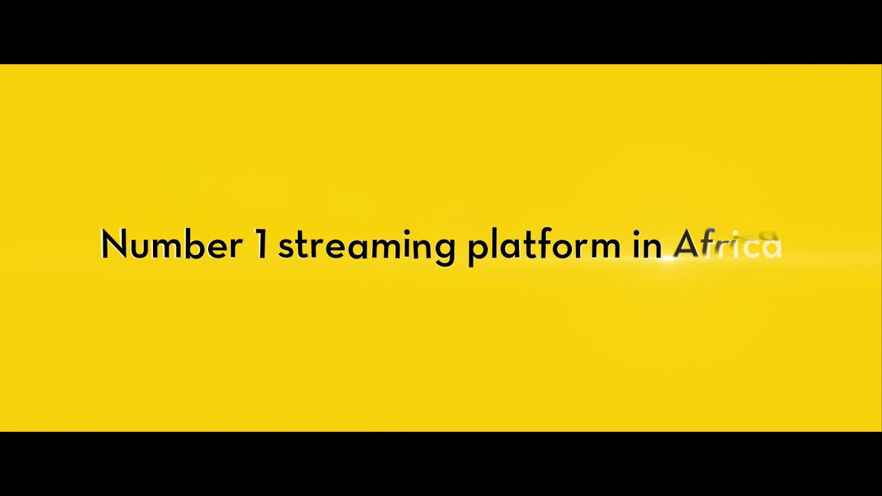
MTN Music+ transformed African music industry
Africa’s groundbreaking digital music service, MTN Music+, maintains its stance in changing the face of Africa’s music industry. MTN Music+ continues to maintain its position as the undisputed King of digital music streaming in Africa, and made its mark as Africa's largest digital music distribution platform...
Richard Iweanoge, MTN GM