Tizen TV app
Sync, play and organize your music in your smart TV. Either you want the ideal atmosphere in your living room or throw a home party, Akazoo Tizen TV music app is a must.
Overview
A music app for Samsung Tizen smart TV where users can sync and play their music, from the core service of Akazoo, add media items in their collection or start a radio for endless streaming.
Tizen TV music app is intended to existing Akazoo subscribers to enhance their home entertainment and complete the cross-platform experience of Akazoo music along with web, tablet and mobile apps.
Responsibilities
UX design
UI design
Successfully delivered
TV app
My role
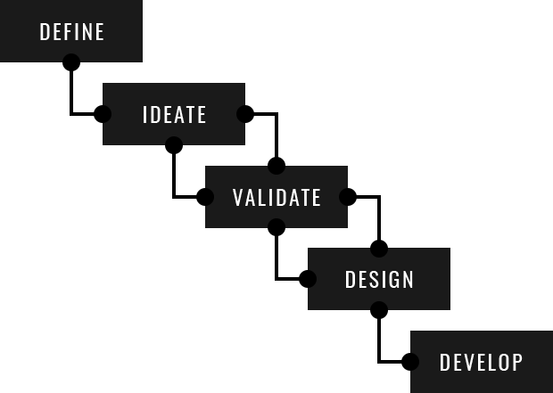
I was the lead designer, responsible for providing screen flows, wireframes, user journey mapping, interactive prototypes, interaction design and transforming them into high-end user interfaces with all required assets needed to develop the TV app. I've conducted in-depth user research and analysis as well as competition analysis to identify and evaluate common interaction patterns and problems.
I coordinated with product managers to define product specifications and guided the developers team to ensure that interaction design was developed as intended and that the overall quality and performance of the app meets the standards of the full HD TV experience.
TV limitations
A smart TV app has very special characteristics that stand out from other platforms like mobile and pc. The foremost is the input method. Although smart TVs have envolved in simplifying user's input (remote touchpads, voice commands, gesture control, etc) users seem to avoid smart input and limit their navigation on arrow controls. Another special charasteristic is that TV is usually watched from a distance - most often 2-3 meters away - meaning that legibility of text and elements is a priority. Last but not least, TV viewing should provide a rich media experience but there are limitations on the hardware performance like processing power, memory, and storage.
Content architecture
My first thought was that the current content architecture of Akazoo music app was too complicated to be implemented on TV. I had to minimize the levels of content depth and re-organize the elements of media items to make them TV friendly.
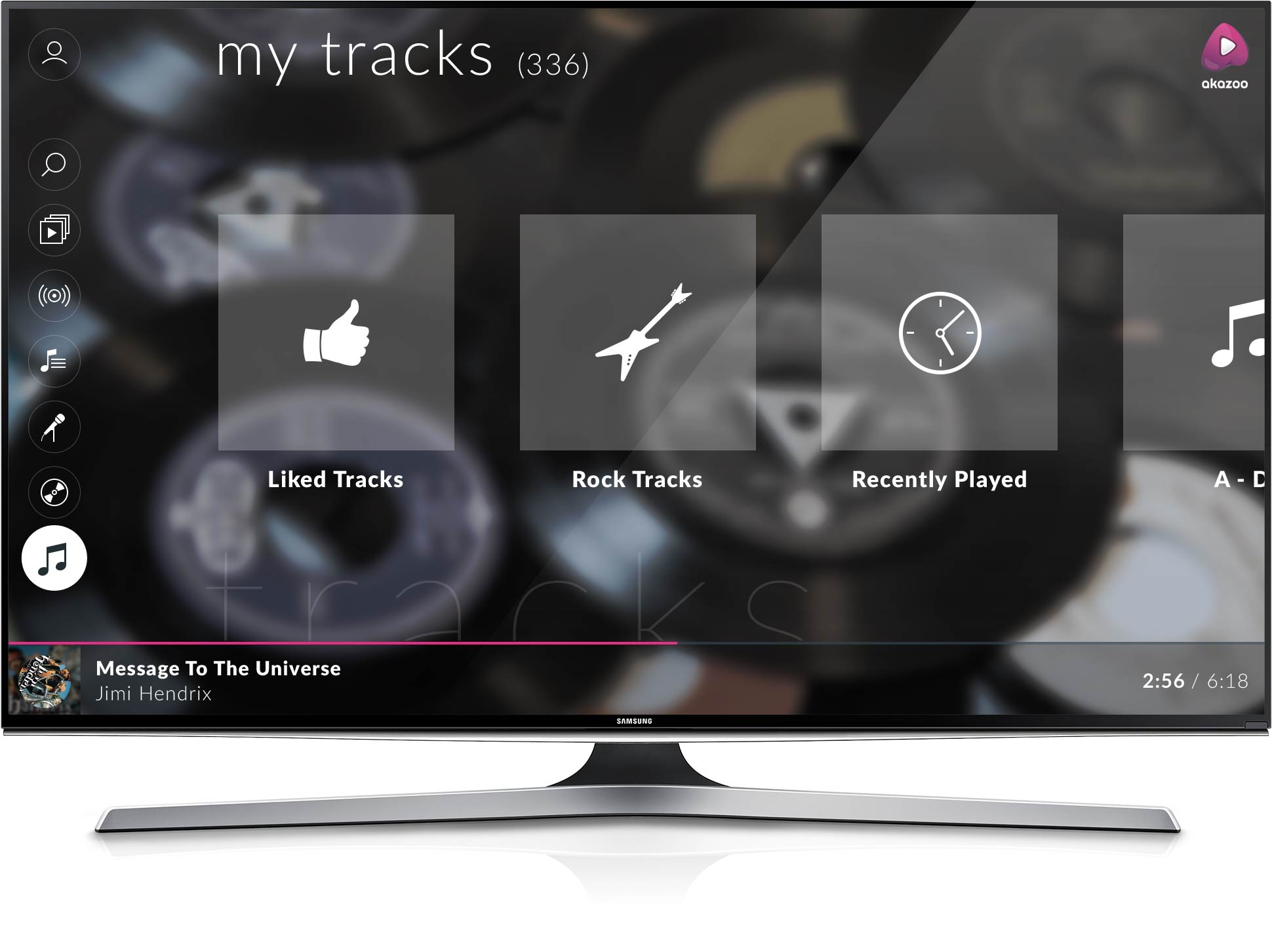
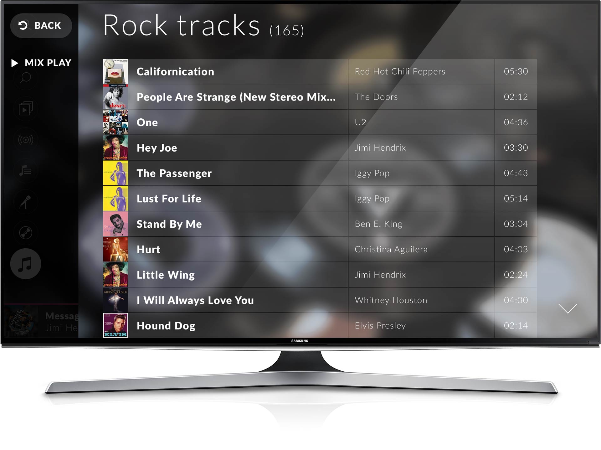
Long track lists had to be eliminated, if possible, because scrolling was not a natural browsing method on TV. Second, havind in mind that TV users want to play music rather than exploring the content, the majority of tracks had to be displayed in groups (playlists) for easier access and fast viewing. Just imagine having a collection of 2,000 tracks in your library and need to scroll to the end of the list to find what you're looking for! In that sense, new backend services were created, especially for user's Collected tracks, to group tracks in genre-related playlists and alphabetic groups (a-d, e-j, k-p, etc.). This way, the long track lists became easier to navigate through and inviting to start streaming.
TV app structure
Navigating the content should be easy, simple and fast. Users should not get confused with many levels of navigation and it should be easy for them to go back where they started. For this purpose, I re-structured the content in up to two navigational levels that always lead to the final goal of the user: play music.
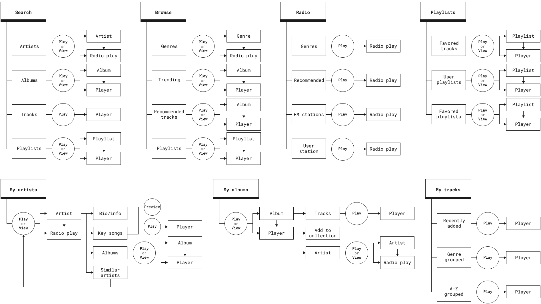
Wireframes
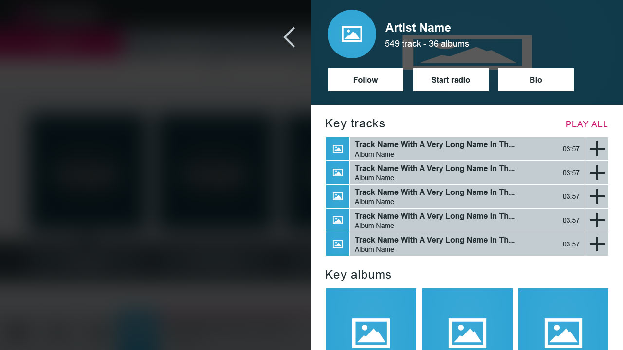
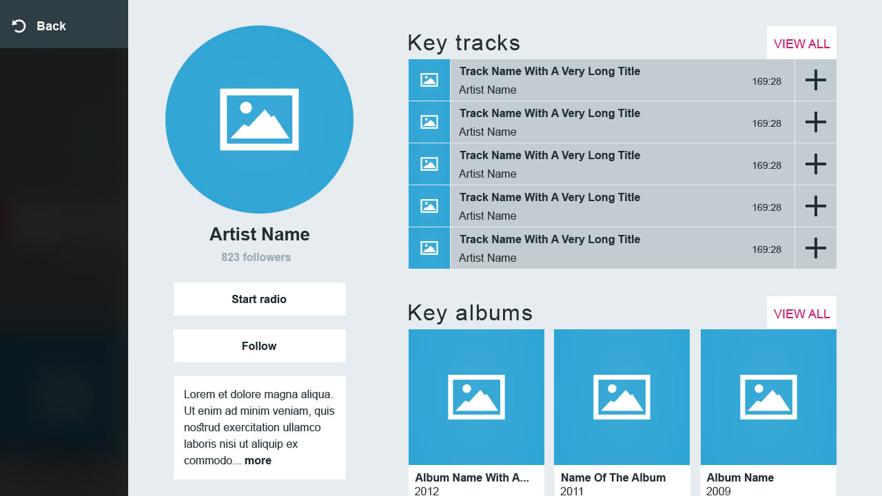
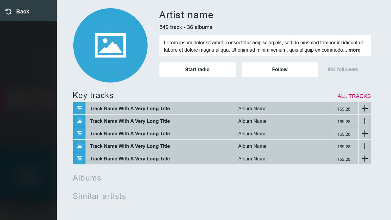
In order to review each screen, all views were designed in wireframes. Initially, all assets were included and were evaluated separately for easiness of access, usefulness score, and frequency of use. The reference screen for this exercise was the Artist page because it was acting as a template view for complex media items.
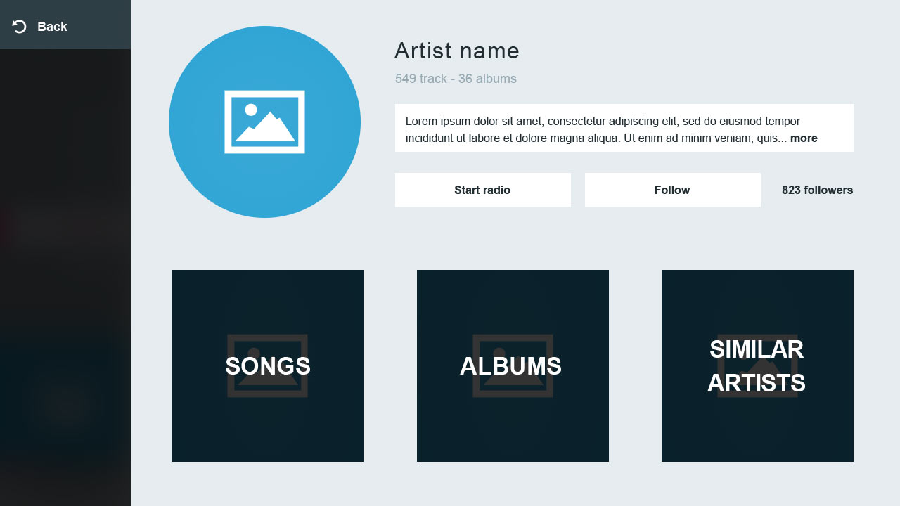
Rethinking of the assets
It was apparent that key tracks were occupying a large area of the view, meaning that the elements afterwards (albums, artists) would be accessed in multiple steps. On the other hand, adding extra levels of navigation for all artist's items would be a set back to the architecture let alone the rich media experience we wanted to provide.
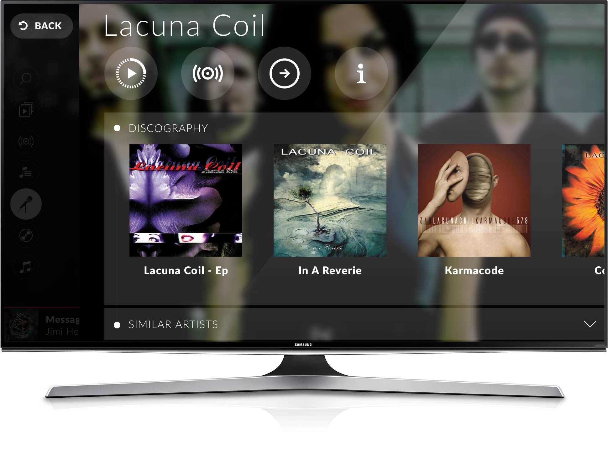
The middle ground solution was to make the problematic key tracks from problem to feature. I added an extra level of navigation only to the key tracks and retained the rich media feel for the rest of the artist view with album covers and related artists. The key tracks were designed on their own view not as a boring track list but as a preview listen area for users that like exploring new music.

User journeys
The next exercise was to test all user journeys and identify issues on the following scenarios: Play a single track, Play an album, Start a genre station, Start an artist station, View a genre, View an artist, View an album, Add a track to collection, Add an album to collection, Add an artist to collection, Add a track to playlist, Add a track to a new playlist, and Add a track to the queue.
I created an interactive prototype and set it up in a real Samsung Tizen TV (not emulator). I asked the users to complete each of the above scenarios, using only the remote control arrows, the OK button, and the remote control Back button.
For the scenarios of adding items to the collection, all users responded as expected. They expected to find the Add to collection action inside the media view. Test passed.
Adding a track to a playlist was tricky. Some users began from Playlists section expecting to select a playlist first and then find a track to add to. No such flow was designed. Test failed. Others, located a track and couldn't understand how to add it to a playlist. They mostly clicked on the track and it started playing on the player. Then by exploring the track context menu inside the player, they located the Add to playlist action. Job was done but they changed view. Test failed. A few users located the track and went straight to the context menu, selected Add to playlist and selected the playlist they wanted to add the track to. Test passed.
Adding a track to a new playlist was even more frustrating as they had to master the Add to playlist action and then locate the New playlist option, let alone the torturing process of typing for a playlist name using the remote control arrows on a TV screen keyboard. Test failed.
The playback scenarios gave a good understanding of the TV user's behavior. Playing a single track was simple and straightforward. All users selected the track and clicked OK on the remote control. The track started playing on the player. Test passed. To play an album or to start an Artist station, they clicked on the item, opened the view and then played it, as expected. Test passed.
Play item or view item?
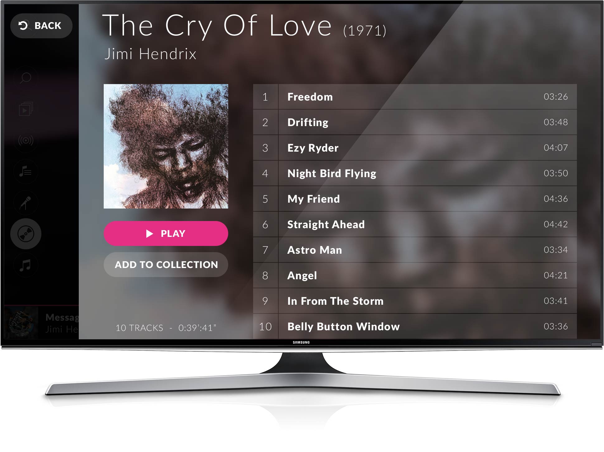
After interviewing the testers at the end of this exercise they all responded that they would mostly expected to instantly play an item after clicking it just like they do on Youtube but since the play action was there after opening the item, they located it easily.
To match this behavior, I added an intermediate action after clicking the item. I let the users choose whether they want to play an item instantly or view it. On the one hand, the reason was to make the users listen immediately their desired media item and on the other hand, to allow users explore a media item before altering their queue list.
I felt extremely proud of this approach after seeing it implemented 2 years later in the updated Youtube TV app. They used the same intermediate screen when playing a playlist and they made the user choose whether to add the track to the current playlist or play the item directly. The actions were diferrent but the logic was the same: avoid altering the play queue unintentionally.

Create playlists on tv? No thanks!
The above exercises gave us an unexpected feedback. Users don't care to create playlists on TV. They just want to listen to them. They don't want to go through additional flows let alone typing using a remote control especially when there's a mobile and web app that can sync the content to the TV. The decision was made by the users and creating playlists was left out of the TV app. In fact, the MVP was launched without contextual menus to minimize development effort and interaction complexity.
Interactivity
Having figured out the views, the content architecture, the assets and the actions needed for the MVP my next step was to create the interaction model for navigating between views with the minimum effort. Interactivity in TV could be made in various ways like the remote control arrows, the remote control colored shortcuts, the touchpad, voice control, gesture control, even a mouse that can be connected to the TV.
I started creating diferrent navigational models for testing but having in mind that most users prefer the most natural way of interacting with a TV app: the remote control arrows, OK and back. Of course, all other interaction means would be supported.
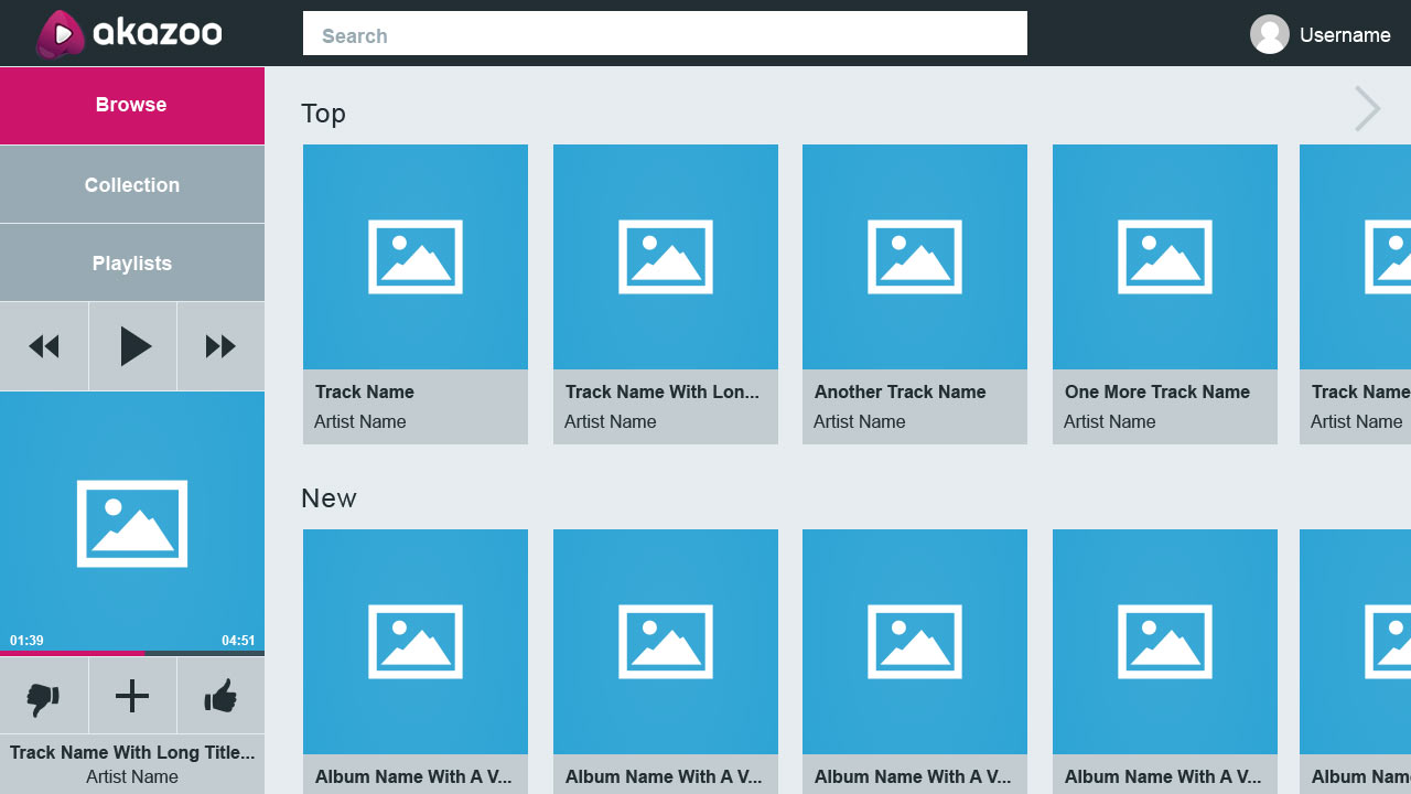
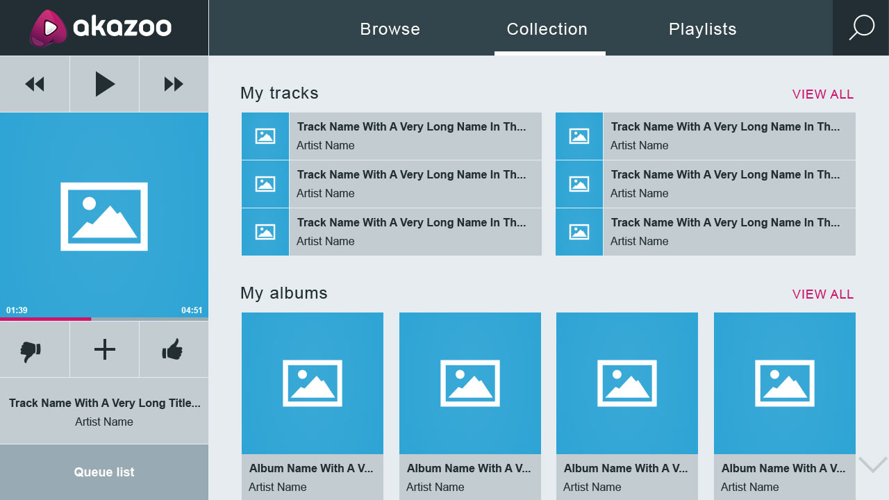
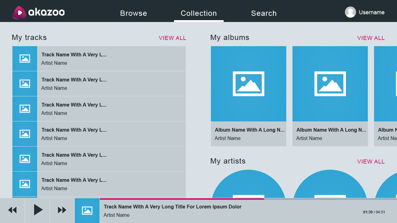
For this exercise, I created 6 navigational models and tested them based on access speed, simplicity and prominence.
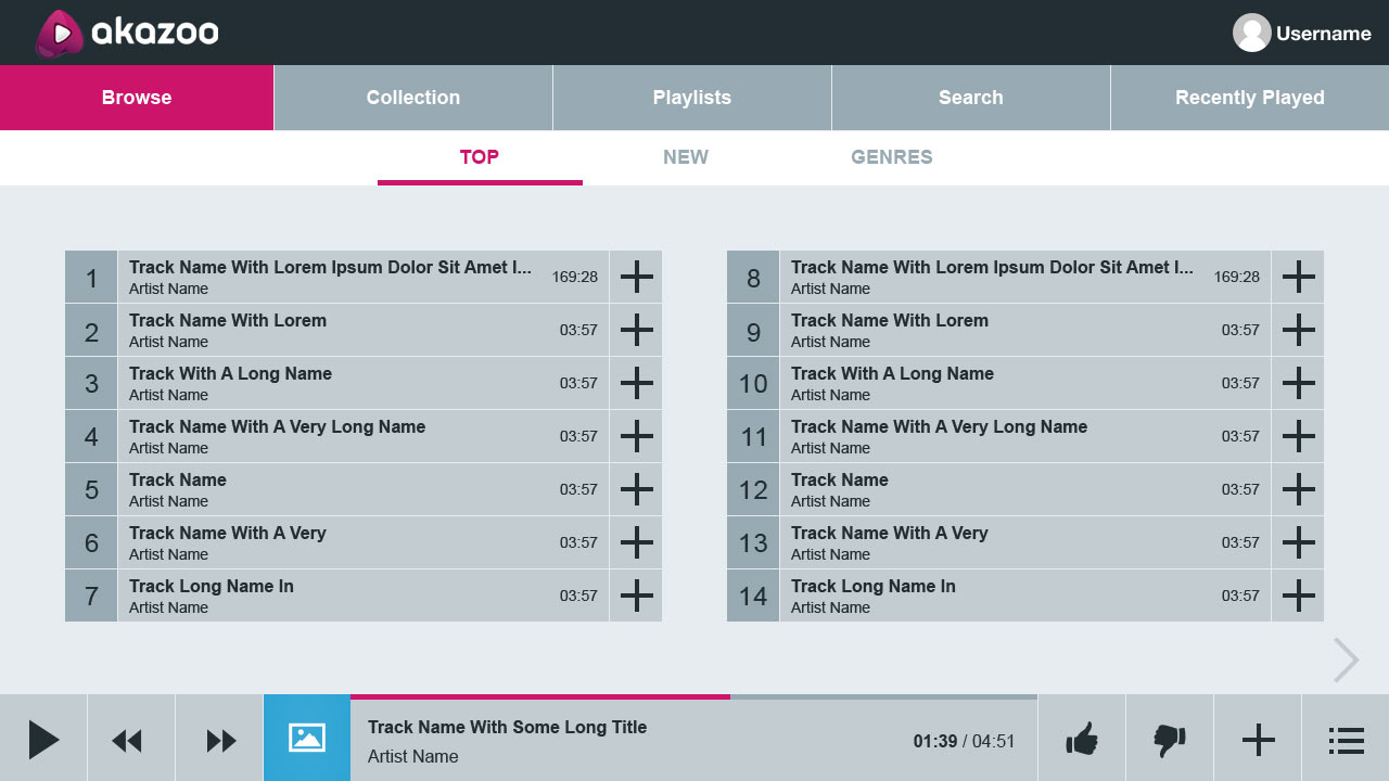
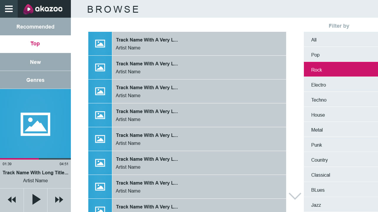
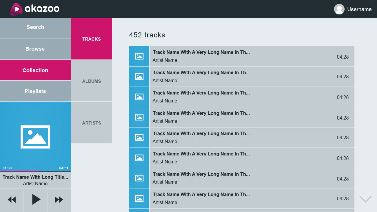
The ideal model
All of the models above had their pros and cons but none was ideal to serve every section and it'd be wrong to use diferrent navigational models between sections. I had to to go back to the ideation and research process. At that time I explored all available media-related TV apps and came to the conclusion that I had two options.
1. Row navigation (up/down for category - left/right for item) for single media items (like Youtube)
2. Column navigation (left/right for category -up/down or left/right for item) for mixed media items
The first one was ideal for videos since there's only a single media item. The second one was ideal for multiple media items like music tracks, albums, playlists, artists and genres that are diferrent between them. The first was ideal for an optimal TV experience, the second was complex and was crowding the screen with various items let alone the steps needed to navigate between sections.
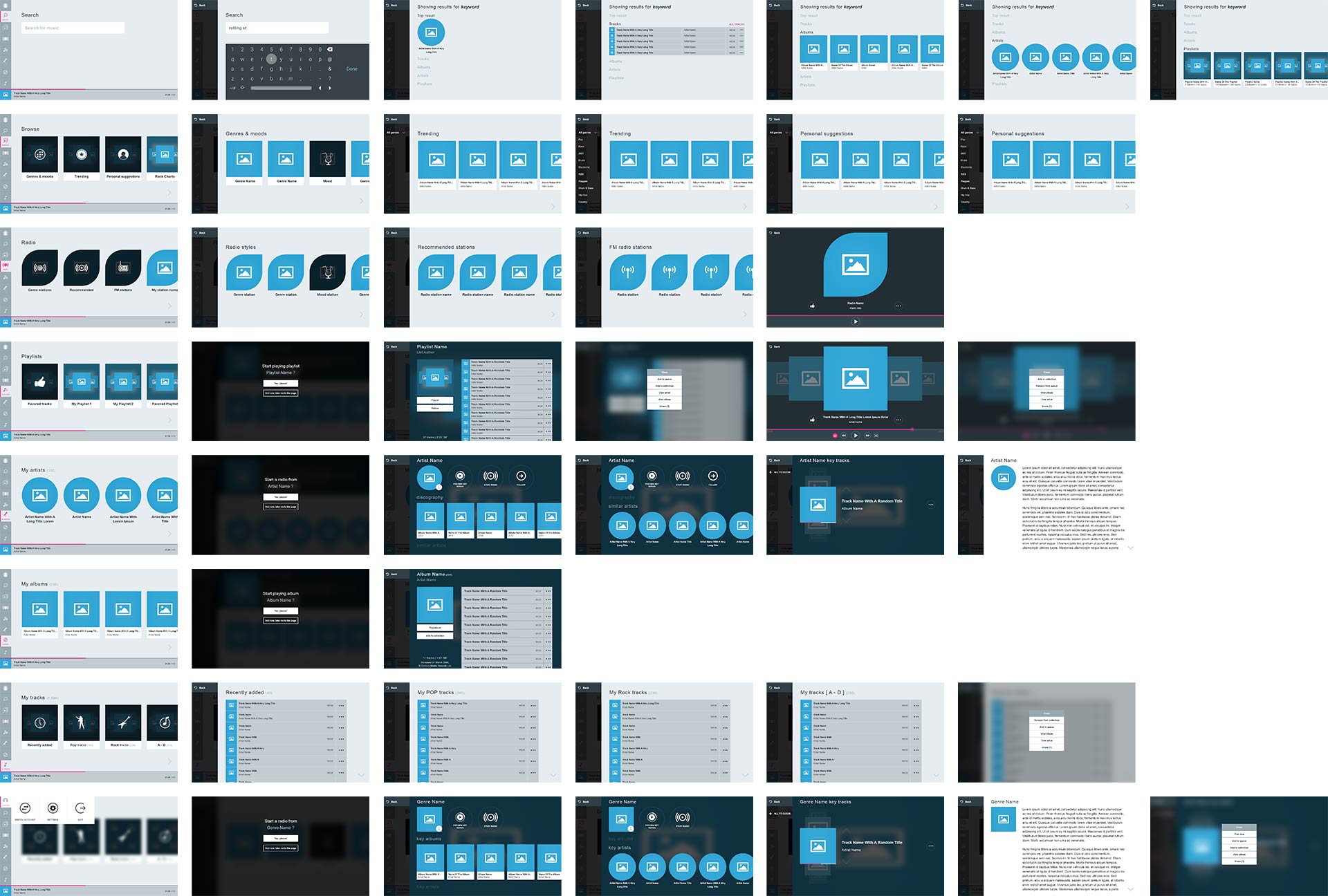
Eventually, I managed to adapt the first model by changing the way the content is served. In cooperation with the backend team we managed to turn single track lists into contextual groups and keep consistency across all media items that appear on the screen, at least in the first level of navigation.

The interactive prototype
Below is the final interactive prototype that was formed after testing all navigational models and finalizing all wireframes. The prototype can be tested with the keyboard's arrows and the Enter key (backspace is also available for history back) to emulate TV's remote control input.
User interface
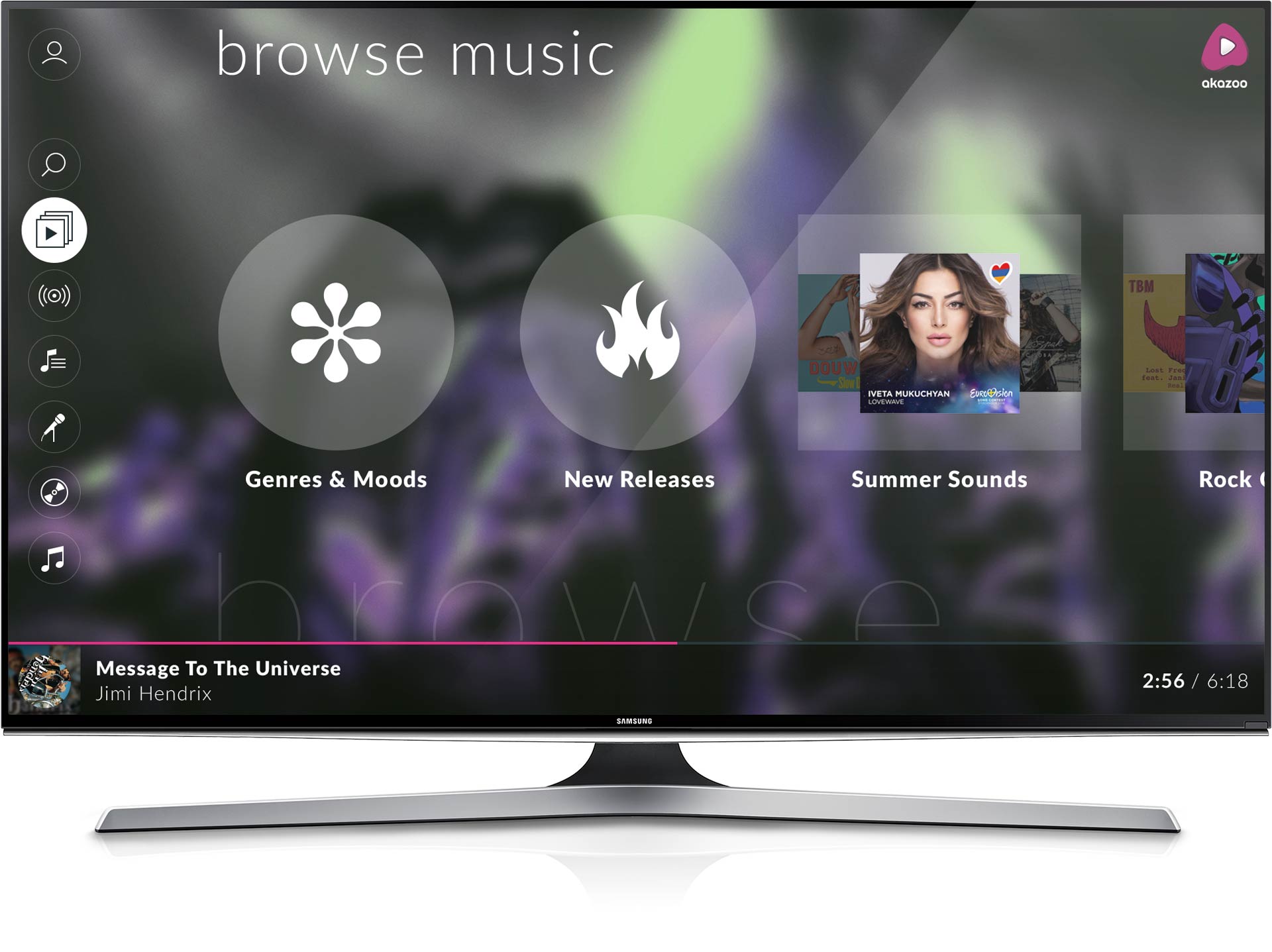
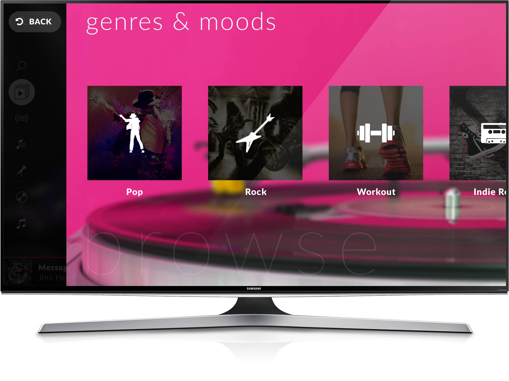
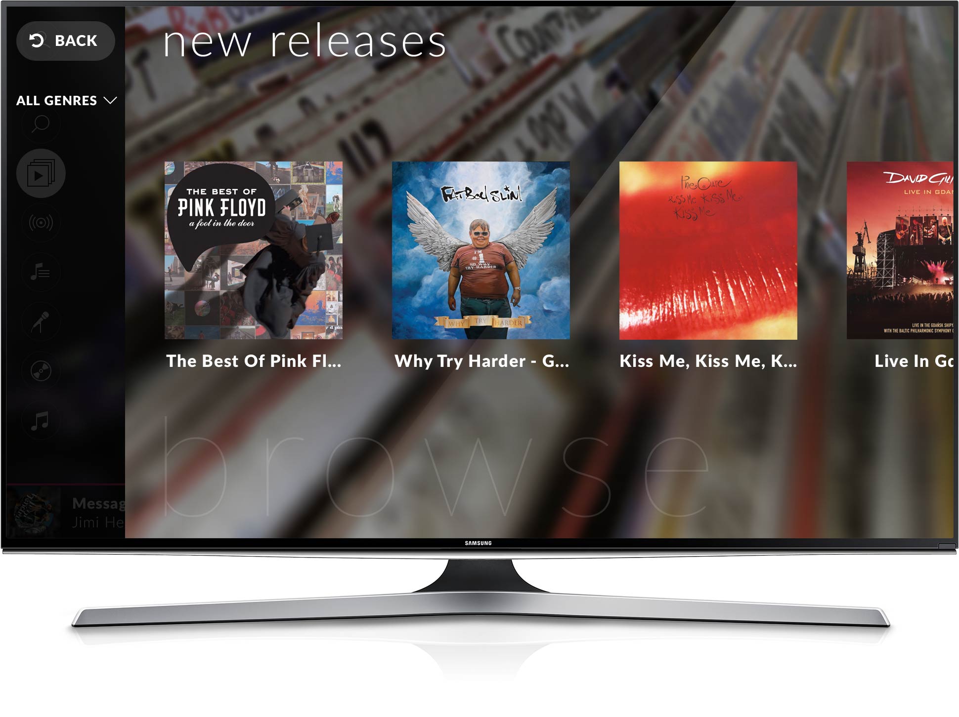
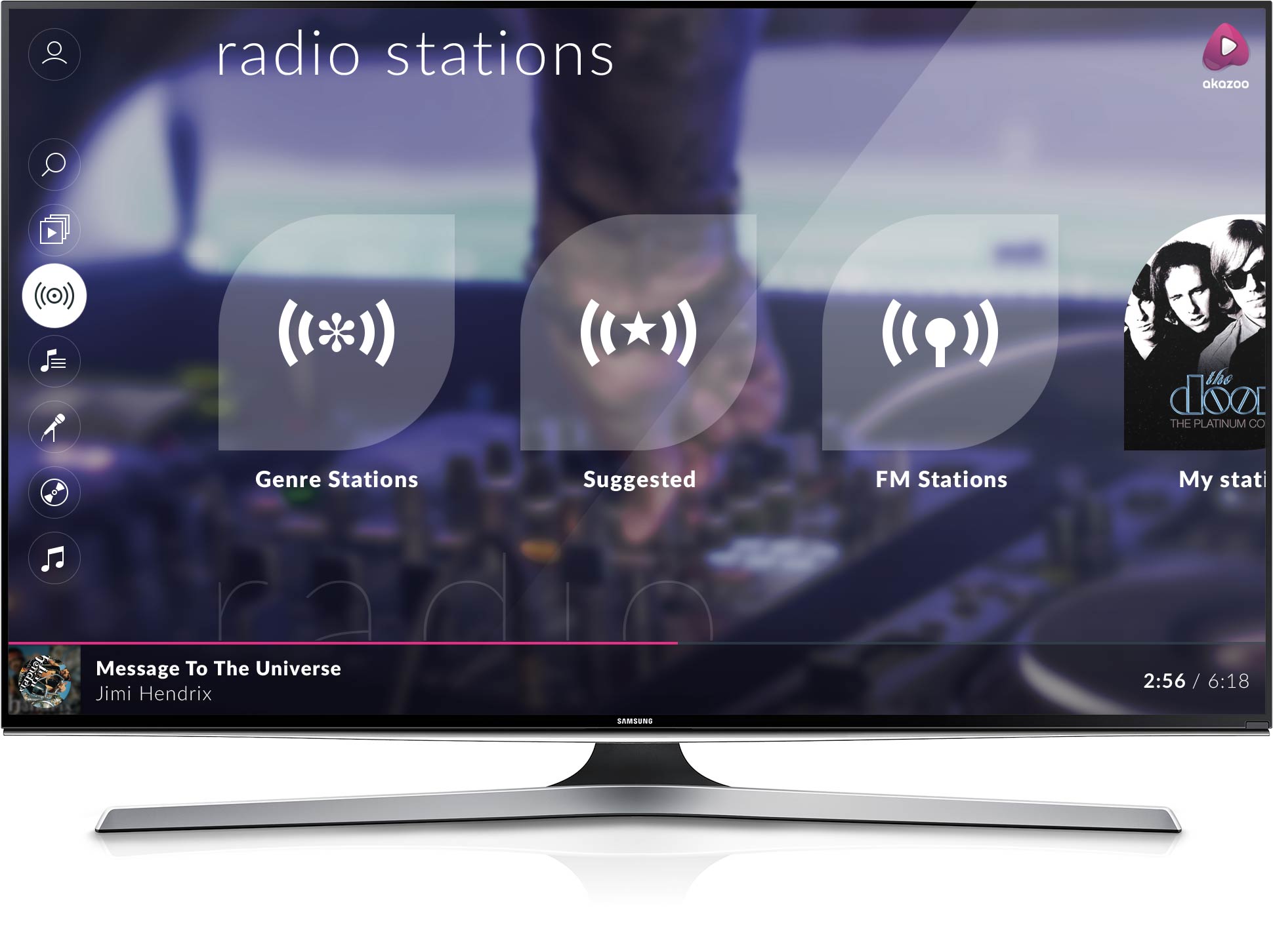
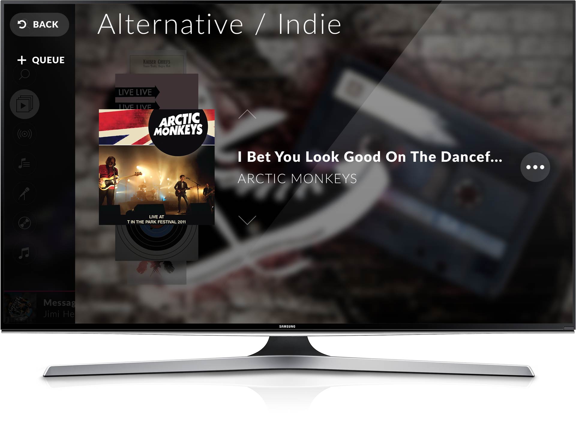
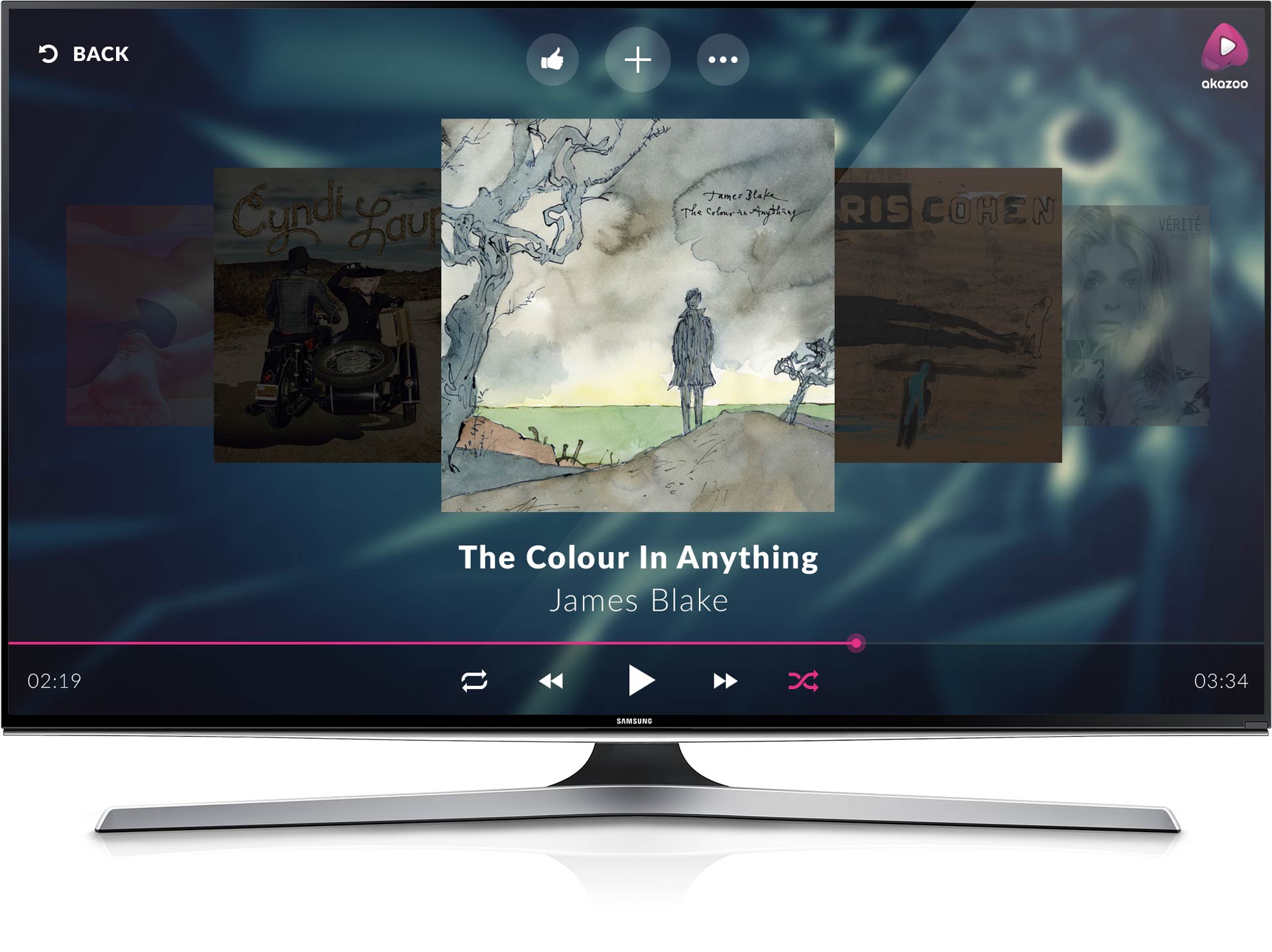
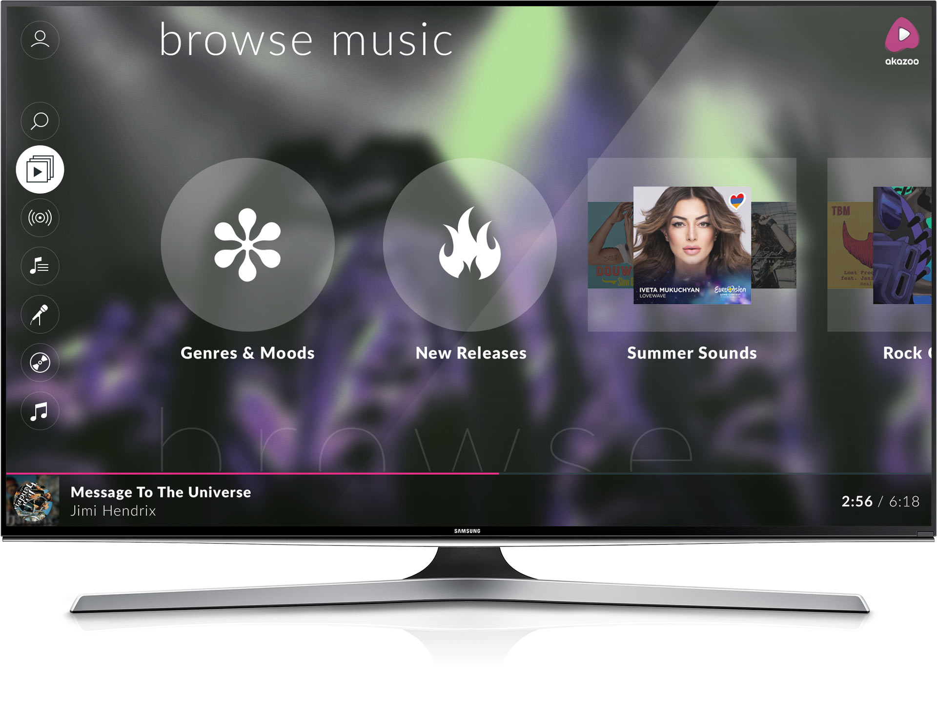
The user interface had to give the sense of a rich cinematic view in the best possible quality. Fullscreen images were used, clear section locations, and large media items and text so that everything is legible from distance. I focused on defining the style based on the content so, the album, the artist and the genre images were set as backgrounds in the corresponding views.
